Native-Feeling Page Transitions With the View Transitions API
The smooth crossfade-and-morph between screens that made single-page apps feel expensive used to cost you a whole framework and a pile of JavaScript. The View Transitions API turns that motion into a browser primitive: one function call for same-page state changes, one line of CSS for real animated navigations between separate HTML pages. Multi-page apps finally get SPA-quality motion for free.
- #view-transitions
- #css
- #web-animation
- #frontend
- #web-platform
- #ux
For about fifteen years, the smooth animated transition between two screens was the tell. If a site crossfaded between views, morphed a thumbnail up into a hero image, or slid one page over another without a white flash, you knew — instantly, subconsciously — that you were in a single-page app. A React or Vue or Svelte bundle was sitting between you and the server, keeping the whole document alive so it could animate the difference. A plain old multi-page site that navigated by fetching a new HTML document? That got the hard cut. White flash, jump to top, done. The motion was a status symbol, and the price of admission was a framework.
That whole arrangement was a workaround for one missing capability, and the browser has now grown it. The View Transitions API lets the browser animate between two DOM states — even two entirely separate pages — with almost no JavaScript. The polished motion that used to justify shipping a SPA is now a platform feature. Here's the mechanic, and why it quietly changes the calculus for a huge number of sites.
Why this was ever hard
Animating between two UI states sounds simple until you try it. To crossfade from an old view to a new one, both have to exist on screen at the same moment — the outgoing state fading out while the incoming state fades in. But a normal DOM update is destructive: you swap the content and the old state is simply gone. There's no frame where both versions coexist.
So frameworks faked it. They'd keep the old node mounted, mount the new one on top, drive opacity with JavaScript on every animation frame, coordinate the timing, and tear the old one down when it finished. Libraries like Framer Motion exist largely to manage that choreography. It works, but it's a lot of machinery to move some pixels — and it's fundamentally impossible on a classic multi-page navigation, because the moment the browser starts loading a new document, your old page (and all its JavaScript) is dead.
The insight behind the View Transitions API is that the browser is the one entity that can see both states, because it controls the swap. So let it take a picture.
The core move: startViewTransition
For same-document transitions — anything where JavaScript is updating the DOM in place — the entire API is one function:
document.startViewTransition(() => {
  updateTheDOM(); // your normal, synchronous DOM update
});
The choreography the browser runs under the hood is worth understanding, because once you see it, the CSS makes sense. When you call startViewTransition and hand it a callback:
- It snapshots the old state — it screenshots the current page (or the relevant parts) as it looks right now.
- It runs your callback, which mutates the DOM however you like. This is just your ordinary update: swap the innerHTML, flip a class, re-render your component. No animation code.
- It snapshots the new state once your update settles.
- It crossfades from the old snapshot to the new one — a real transition, with both states on screen at once, driven entirely by the browser.
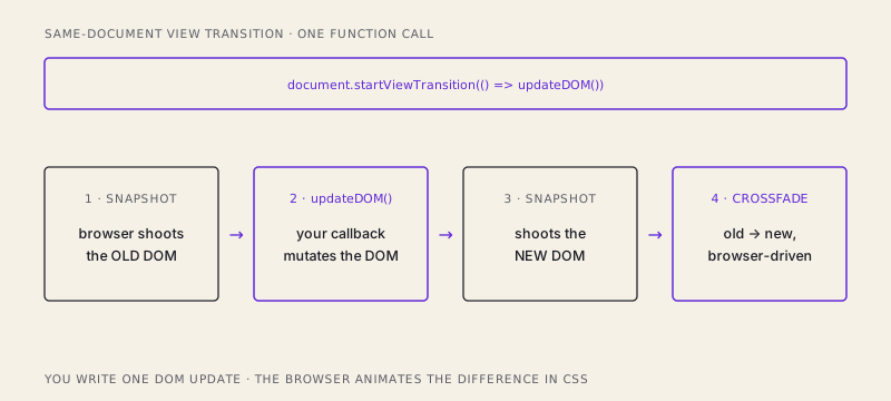
Your JavaScript did exactly one thing: change the DOM. It wrote zero lines of animation logic. And here's the part that makes it composable rather than a black box — you customize the animation entirely in CSS, through a set of pseudo-elements the browser generates during the transition:
::view-transition-old(root) {
  animation: 240ms ease-out both fade-out;
}
::view-transition-new(root) {
  animation: 240ms ease-in both fade-in;
}
::view-transition-old(root) is that screenshot of the outgoing state; ::view-transition-new(root) is the incoming one. Want a slide instead of a fade? Animate transform instead of opacity. Want it slower, bouncier, directional? It's all CSS keyframes now, living in your stylesheet next to the rest of your styles — not buried in a JavaScript animation loop. The default, if you write no CSS at all, is a clean crossfade. You get something reasonable for free and reach for CSS only when you want more.
Morphing one element into another
The crossfade is nice, but the effect that actually makes people say "whoa" is the shared-element transition: a thumbnail in a grid that smoothly grows and slides into position as the hero image on the detail page. iOS has done this for years and it reads as deeply "native." On the web it used to be a genuine ordeal of measuring bounding boxes and animating transforms by hand.
Now it's a naming exercise. You give the two elements — the little thumbnail and the big hero — the same view-transition-name, and the browser understands they're the same conceptual thing in two places:
/* on the grid page */
.card-image { view-transition-name: hero-photo; }

/* on the detail page */
.hero-image { view-transition-name: hero-photo; }
When the transition runs, the browser sees a matching name in both the old snapshot and the new one. Instead of crossfading those two elements, it tweens — it animates the element from its old position and size to its new position and size, morphing the small square in the grid into the large banner on the detail page. Position, dimensions, and even aspect ratio interpolate smoothly.
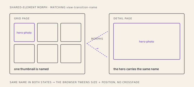
The only rule to remember: a given view-transition-name must be unique on the page at any moment — it's a one-to-one match between the old state and the new state, not a group selector. Two elements sharing a name in the same snapshot is an error. One going out, one coming in: perfect.
The big one: transitions between separate pages
Everything above still assumes JavaScript is driving a same-document update. The genuinely new territory — the reason this API is a big deal and not just a nicety — is cross-document view transitions: real animated navigations between separate HTML pages, the kind a plain server-rendered multi-page site serves. No SPA. No client-side router. No framework keeping the document alive.
The opt-in is one CSS rule, in both pages:
@view-transition {
  navigation: auto;
}
That's the whole handshake. With that rule present on the page you're leaving and the page you're arriving at, the browser bridges the navigation for you: as you click a link and it loads the next document, it snapshots the outgoing page, snapshots the incoming one, and crossfades between them — the same machinery as startViewTransition, but spanning a full page load. And because it's the same machinery, everything else comes along: put view-transition-name: hero-photo on the thumbnail in your list page's HTML and on the hero in your detail page's HTML, and the shared-element morph works across a real navigation between two files on disk.
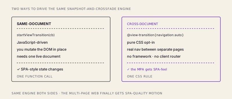
Sit with what that means. A blog, a docs site, an e-commerce catalog, anything server-rendered with ordinary <a href> links — the architecture we spent a decade abandoning specifically because it couldn't do smooth transitions — can now do smooth transitions. The single strongest UX argument for reaching for a SPA framework just became a couple of lines of CSS on an MPA.
The two caveats you actually have to honor
This is genuinely new platform surface, so two things deserve honesty.
Browser support is still rolling out. Same-document transitions have broad support; cross-document support is landing progressively across engines. But this is the good kind of unfinished, because the API was designed as progressive enhancement from the start. In a browser that doesn't support it, document.startViewTransition(cb) simply runs your callback with no animation, and @view-transition is an unknown at-rule the browser harmlessly ignores. Either way, the user gets the plain instant swap — exactly what they'd get today. Nothing breaks; some users just get the fancier version. You never have to gate features or ship a fallback path by hand.
Respect prefers-reduced-motion. A sweeping morph is delightful to most people and nauseating to some. Motion sensitivity is a real accessibility concern, and the browser hands you the animations but not the judgment. Honor the user's system setting explicitly:
@media (prefers-reduced-motion: reduce) {
  ::view-transition-group(*),
  ::view-transition-old(*),
  ::view-transition-new(*) {
    animation: none !important;
  }
}
That collapses the transition to an instant, non-animated swap for anyone who's asked their OS to reduce motion — the content still updates correctly, it just doesn't fly around. Treat it as non-optional, the same way you'd treat a focus outline.
The takeaway
For fifteen years, "screens that animate smoothly between each other" was a capability you bought — with a framework, a bundle, and a pile of animation code — and it was flatly unavailable to multi-page sites. The View Transitions API turns it into something the platform simply does: one function call to animate a same-page update, one CSS rule to animate a real navigation between separate documents, and matching names to morph an element from one screen into the next. SPA-quality motion is now a browser feature — and the multi-page web, the boring reliable HTML-over-the-wire kind, finally gets it too.
/share

Kishore K Sharma
Lead Full Stack Engineer | Java · Spring Boot · Distributed Systems · AWS | Building Scalable Cloud-Native Platforms